
Every traveler notices the famous Sedona turquoise McDonald’s when driving along State Route 89A in northern Arizona. For instance, instead of bright yellow arches, soft blue-green letters greet visitors against a dramatic sandstone backdrop. This unique building looks entirely different from every other fast-food location across the globe. However, this bold color choice was not a random corporate marketing experiment.
The city of Sedona enforced strict visual building regulations when the franchise arrived in 1993. Consequently, local leaders required the corporate chain to blend with the natural desert environment. The result is a masterclass in regional architecture and exterior color coordination. In addition, this famous site offers valuable lessons for homeowners designing exterior color schemes.
The Real History Behind the Sedona Turquoise McDonald’s
City Planning and the 1993 Zoning Battle
Sedona officially incorporated as a city in 1988. Shortly after, officials drafted a comprehensive Land Development Code to safeguard local scenic beauty. Therefore, municipal planners closely evaluated every new commercial construction project.
When franchise owners approached the city in 1993, tension quickly surfaced. Specifically, the brand wanted standard yellow arches and tall commercial signage. City planner John O’Brien firmly rejected those standard corporate designs.
As a result, long negotiations began between corporate executives and city officials. The local government demanded a low-profile building with subdued regional finishes. McDonald’s eventually agreed to modify its iconic symbol to satisfy these rules.
Preserving Natural Views Over Corporate Identity
Officials feared bright yellow signs would clash against the towering red sandstone cliffs. Moreover, the city insisted that architecture must serve the environment rather than compete with it. The team chose a soft turquoise tone inspired by traditional local minerals.
In fact, this change marked the first time the company altered its global logo color. The building opened on April 14, 1993, to immediate public curiosity. Furthermore, the location became an instant roadside attraction for travelers worldwide.
In 2015, the restaurant updated the arches with subtle backlighting for evening visibility. Meanwhile, staff donated the original 1993 turquoise arches to the Sedona Heritage Museum. Consequently, this design adaptation remains a proud chapter in local civic history.
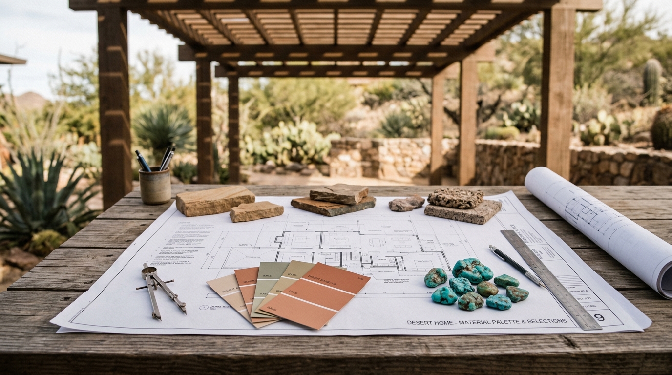
Careful exterior color planning ensures architectural materials harmonize with natural outdoor surroundings.
The Color Science: Why Turquoise Balances Red Rock Terrain
Understanding Complementary Color Wheels
Color theory explains why turquoise works so well against desert red stone. Specifically, orange and red sit directly opposite blue and green on the color wheel. Therefore, pairing terracotta tones with turquoise creates natural complementary visual balance.
This dynamic contrast catches the eye without causing visual agitation. In addition, the cool turquoise hue relieves the warm intensity of sunbaked desert rock. Natural minerals in regional sandstone create a harmonious organic backdrop for cyan tones.
However, successful color balance requires precise ratios between warm and cool shades. The warm adobe base covers most of the structure, providing grounding stability. As a result, the turquoise accents stand out cleanly without overwhelming the eye.
Preventing Visual Noise in Exterior Design
High-contrast neon colors frequently create visual clutter in natural settings. For example, standard golden yellow signs would compete aggressively with orange-red canyon cliffs. That jarring clash degrades the natural visual serenity of scenic corridors.
By shifting to turquoise, designers achieved vibrant visibility without abrasive glare. Furthermore, the muted mineral shade echoes native jewelry and regional cultural art. Therefore, the signage feels naturally integrated into the surrounding desert community.
Homeowners can apply this exact principle to exterior home accents. Specifically, surrounding natural scenery should always dictate your exterior trim selections. Consequently, your home will harmonize with its environment instead of fighting against it.
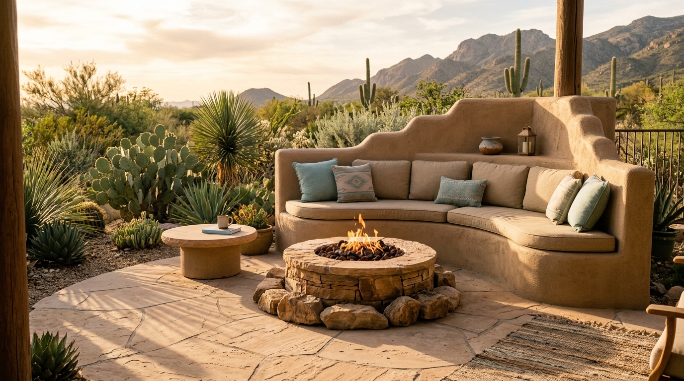
Muted desert tones create a balanced foundation for refreshing turquoise accents and native plantings.
Southwestern Architectural Principles for Everyday Homes
Embracing Pueblo Revival Lines and Adobe Tones
The Sedona franchise features distinctive Pueblo Revival architectural styling. For instance, flat roofs, stepped parapets, and rounded stucco corners define the building silhouette. These organic forms soften the commercial structure, blending it smoothly into the terrain.
Similarly, residential architecture benefits greatly from these gentle, grounded geometric shapes. Parapets hide rooftop utility equipment and reduce harsh angular rooflines. In addition, deep window recesses shield interior living spaces from intense desert sun.
These classic design choices create an authentic sense of place. Moreover, they honor regional building traditions dating back hundreds of years. Thus, homeowners can borrow these structural strategies to enhance curb appeal.
Selecting Earthy Base Colors for Facades
The base of the building uses a rich ginger-tan exterior stucco. Meanwhile, the upper tier features a lighter, sun-washed desert sand shade. This subtle two-tone approach adds architectural depth while maintaining natural harmony.
When selecting exterior paint for your home, always start with regional earth tones. For example, warm sand, soft taupe, terracotta, and muted adobe work exceptionally well. These neutral foundations ground your property in its natural outdoor setting.
Furthermore, earthy stucco colors hide airborne desert dust and mineral weathering. As a result, exterior walls look fresh and clean for many years. Therefore, thoughtful base color selection provides both aesthetic beauty and practical durability.
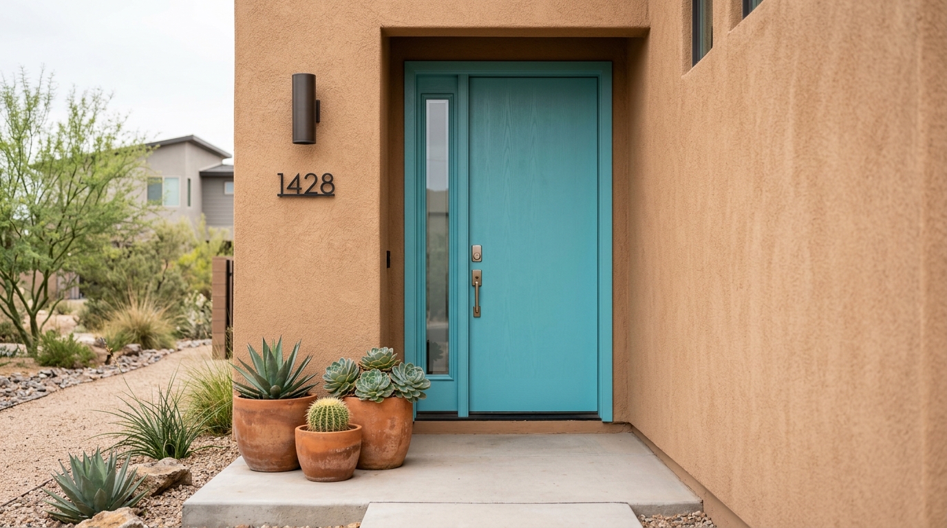
A bold turquoise front door adds personality while warm stucco maintains overall neighborhood harmony.
How to Use Bold Accent Colors Without Breaking HOA Rules
Working Within Strict Municipal and Neighborhood Guidelines
Many modern neighborhoods enforce strict Homeowners Association exterior color guidelines. However, strict rules do not mean your home exterior must look boring. Indeed, the Sedona example proves you can introduce personality within strict design codes.
First, reserve your bold accent colors for small, intentional focal points. For instance, front entry doors, decorative ceramic planters, and address plaques work best. This controlled approach introduces character without violating overall neighborhood uniformity.
In addition, always check your community development rules before purchasing exterior paint. Most associations provide pre-approved color palettes containing complementary accent options. Consequently, submitting clear color swatches ensures faster architectural committee approval.
Testing Paint Swatches in Natural Desert Sunlight
Harsh outdoor sunlight drastically alters how paint colors appear on exterior walls. For example, intense desert midday sun washes out delicate, low-pigment colors. Meanwhile, evening golden-hour light warms up cool blues and greens significantly.
Therefore, always paint large test swatches directly on your exterior wall surfaces. Observe these test patches in direct morning daylight, midday sun, and evening dusk. This careful testing prevents costly mistakes and ensures accurate color rendition.
Furthermore, select matte or satin exterior finishes rather than high-gloss coatings. Matte surfaces absorb harsh glare and create a softer, more sophisticated finish. As a result, your chosen accent color looks rich under varying lighting conditions.
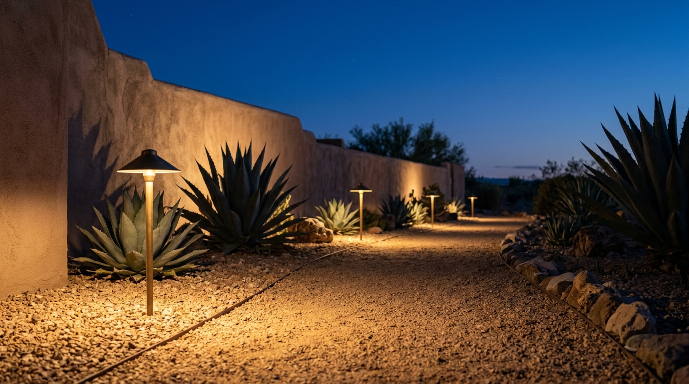
Warm low-voltage pathway lighting enhances exterior wall textures without causing night sky glare.
Lighting and Texture: Completing the Southwest Aesthetic
Choosing Matte Finishes Over Glossy Surfaces
Texture plays a major role in achieving authentic southwestern design balance. Specifically, rough stucco, natural flagstone, and unpolished clay absorb bright sunlight beautifully. In contrast, glossy plastic or polished metal surfaces create distracting exterior glare.
For this reason, choose authentic architectural materials with rich tactile quality. For instance, incorporate natural red sandstone pavers along entry pathways and garden borders. In addition, use hand-formed ceramic pots to hold native desert succulents.
These natural textures add depth and warmth to your home entrance. Moreover, they pair effortlessly with cool turquoise and warm terracotta tones. Consequently, the entire outdoor space feels cohesive, grounded, and welcoming.
Soft Exterior Illumination for Nighttime Curb Appeal
Sedona is a designated International Dark Sky Community with strict lighting codes. Therefore, outdoor lighting must point downward to prevent night sky light pollution. This thoughtful lighting strategy produces a subtle, warm ambient glow around buildings.
Homeowners can easily recreate this sophisticated nighttime look in their own yards. Specifically, install shielded low-voltage fixtures that cast warm light along stone pathways. Furthermore, use subtle uplights behind native agaves to cast dramatic organic silhouettes.
Avoid harsh floodlights that wash out architectural textures and irritate neighbors. Instead, gentle 2700K warm lighting creates an inviting, serene outdoor atmosphere. Thus, your home exterior maintains its distinctive charm day and night.
Designing Your Own Southwestern Exterior Palette
A Practical Five-Step Color Planning Framework
Creating a balanced exterior palette requires a systematic, step-by-step approach. Follow this practical framework to coordinate your home colors with natural outdoor surroundings:
- Step 1: Survey Your Natural Environment: Examine the soil, rock formations, and native plant life surrounding your property.
- Step 2: Establish the 60% Dominant Base: Choose a warm sand or muted terracotta stucco for main walls.
- Step 3: Define the 30% Secondary Shade: Select soft taupe, adobe, or cedar trim for fascias and window frames.
- Step 4: Introduce the 10% Vibrant Accent: Apply matte turquoise, sage green, or deep copper to the front door.
- Step 5: Add Organic Textures: Complete the design with sandstone pavers, gravel pathways, and ceramic garden planters.
This proven design formula keeps your exterior balanced, dignified, and visually compelling. In addition, it guarantees that your accent color remains an intentional visual highlight.
Common Mistakes to Avoid in Exterior Color Design
Many homeowners make the mistake of using overly saturated base paint colors. However, bright orange or deep red walls can quickly overwhelm a residential street. Therefore, keep large surface areas soft, muted, and grounded in neutral tones.
Another frequent misstep is ignoring regional architecture when selecting bold paint colors. For instance, neon turquoise accents on a colonial home often look disjointed. In contrast, pairing turquoise with adobe or stucco creates effortless aesthetic harmony.
Finally, remember to coordinate your hardscape materials with your exterior paint choices. As a result, your gravel, stone walkways, and exterior walls will look unified. Thus, your entire property achieves a polished, well-planned aesthetic appeal.
Bringing the Sedona Color Palette to Your Outdoor Space
The famous Sedona turquoise McDonald’s proves that bold corporate brands can respect local character. By honoring natural surroundings and color theory, architecture gains lasting cultural and visual value. Furthermore, this landmark continues to inspire innovative residential and commercial exterior design.
Whether updating your front entryway or planning a full renovation, embrace regional harmony. Specifically, pair warm earth tones with thoughtful cool accents to create unforgettable curb appeal. Consequently, your outdoor living space will celebrate nature while showcasing your personal style.
Emma D. is the creator, administrator, and voice behind Forum Sever. With a deep-rooted passion for vintage charm and practical living, Emma shares thoughtful homemaking guides, creative DIY projects, heirloom gardening advice, and stories celebrating everyday nostalgia.
Whether reviving timeless family recipes, propagating backyard perennials, or transforming thrifted finds into cozy home centerpieces, her goal is simple: helping readers cultivate a warm, intentional, and handcrafted life. When she isn’t managing the community at Forum Sever, you’ll likely find her in the garden with dirt on her hands, a notebook by her side, and a warm cup of herbal tea nearby.